Let us say I have this SQL SELECT:
SELECT fld1, fld2, fld3, fld4, fld5, fld6, fld7, fld8, fld9, fld10 from mytable into cursor junk nofilter
So I have 10 fields above. Normally we would have 10 columns as well to show everything inside a grid, a column for each field, a record for each row. Now, I wanted to show only 2 columns where fields 1 to 5 will all be cramped inside Column1 and the rest on Column2. Here is how to do it.
By default, a grid will bind itself to the current active table/cursor and will follow the field arrangement like in the above fld1, fld2.....etc. Ignore the sequence of the fields because it will be useless now.
a. Create container1 on form. It is easier to manipulate the appearances and positions of objects inside the container when you do it on form (outside the grid). We will put that later inside the grid
b. Inside Container1, add 5 textboxes. Play with controlsource like:
text1.ControlSource = junk.fld1
text2.ControlSource = junk.fld2
* and so on, you can add some more objects like labels if you like
c. Play with those objects' borderlines, opacity, etc. to suit your taste
d. Click on another object in the form then click back on container. Make the container borderwidth = 0, backstyle = 0
e. When everything seems to satisfy you, press Ctrl+C
f. Press Ctrl then click on the grid to turn it into edit mode. Click on the target column
g. Paste on the target column the container object via Ctrl+V
h. Go back to that Column1 and change its CurrentControl to your container instead of the default Text1.
i. Set its Sparse setting to .F.
Repeat the same process for Column2 (create container, etc.) up to letter i. Run your form and that is it. Enjoy!
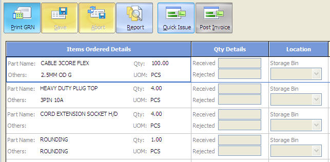
Here is how mine looks:

Tidak ada komentar:
Posting Komentar